Have you ever been excited to show your team all the data you’ve acquired only to notice that their eyes glaze over when you start presenting your findings? While data allows us to gain strategic business insights, too much complex information delivered at one time can be overwhelming. Data visualization tools can help you present powerful facts and figures in ways that are engaging and easy to understand.
Technology is giving us tremendous opportunities to collect increasingly more data. Data visualization tools make that data digestible through the use of pie charts, bar graphs, funnels and other types of graphics. Data visualization is a high-impact way to tell our story and give decision-makers a simplified way to understand performance and make correlations. The presentation of data in a visual format can help you avoid a ‘data puke’ as Avinash Kaushik, the renowned Digital Marketing Evangelist, puts it.
We Are Visual Learners
The goal of reporting data to our clients is to share insights into specific metrics with stakeholders in a meaningful way that engages them and helps drive business decisions. We want to make it as easy as possible to identify actionable insights based upon patterns and trends that are buried within the overwhelming rows of data. When looking at a data table, there is so much information to process, that the audience usually doesn’t know where to look first and then they have to make the correlation between the data in its intended context. Even when we have an accompanying verbal explanation, the brain still has to associate what is being said with the numbers. With data visualization, we are directly showing our audience the point that we are trying to make while providing a narrative since our brains are naturally wired to see patterns and trends visually.
Show What Matters & Provide Context
Data visualization also helps us present information that is truly relevant. A data table can have endless columns of metrics, yet in a visualization, we choose the metrics and relationship to show based upon answering a business question. Instead of leaving the stakeholder to figure out if the rows of data are indicating good or bad performance, we can provide context so the conversation can be around insights and next steps, rather than spending time deciphering the data.
It’s also important to understand data in terms of drivers and outcomes as not all visualizations are created equally. For example, the holy grail metric, profit, is an outcome (or result) metric. While viewing a trend of profit is probably the most requested type of chart, it’s looking in a rear-view mirror of what has already happened, but not why. We need to offer an insight into how to impact it.
The metrics that are drivers, and have the most impact, can be broken down into two types: those that we have control over and those that we do not.
Let’s say we own an ice cream shop. The weather is a perfect example of a driver metric that impacts our revenue, but yet we don’t have control over it. While it’s nice to see how weather affects revenue, there’s not much we can do about it. Therefore, we’d want to focus on something like promotions, which we have control over.
Another benefit of data visualization is its interactive nature that allows the user to dive deeper instead of looking at a static image. We can ask questions such as “how did a specific marketing change affect overall performance?” then compare performance over multiple date ranges.
Data Visualization In Action
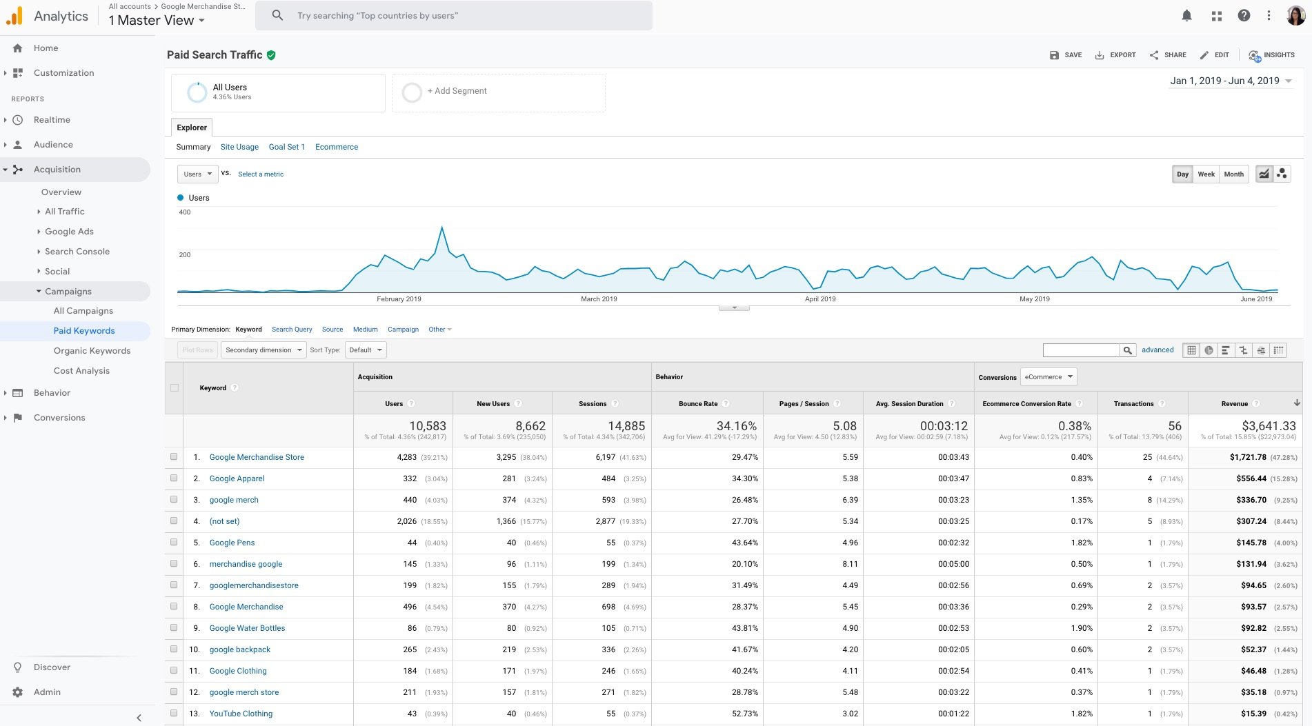
Here’s an example that marketers are very familiar with… Google Analytics data. (Source: Google Merchandise Store public data)

We’ve all seen this and let’s admit that we’ve all used this in presentations at least once. While it’s really easy to just grab a screenshot, we need to think about what we want to convey to our audience. Why do we want them to have to figure out what we’re showing them?
If I was presented with this screenshot, the first thing I would do is determine how the data is sorted; I scan through 9 columns to see that the data is sorted by revenue, descending. Okay, that tells me that the keyword ‘Google Merchandise Store’ has the most revenue. The other 8 metrics tell me about keyword performance with respect to other factors, yet, I now have to scan the other columns, which are not sorted, to garner any additional information. That’s a lot to decipher!
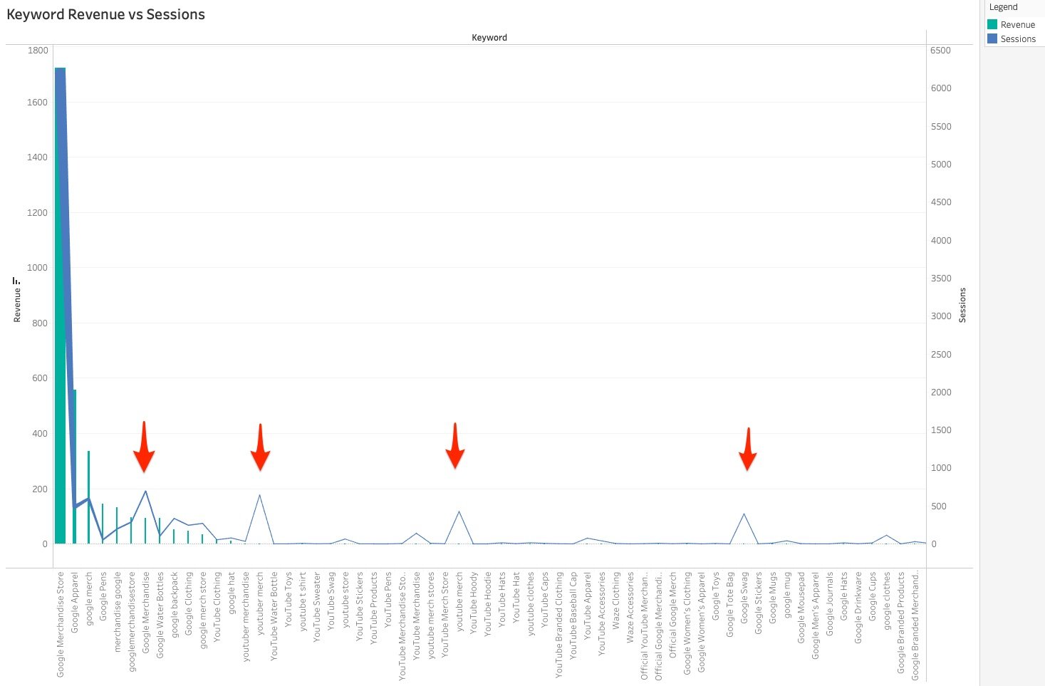
A better visualization would be to compare two metrics. This immediately gives context to the revenue generated by each keyword relative to the number of sessions. We see that we should investigate further as to why the keywords with significant traffic are not generating much if any, revenue.

An even better visualization would try to answer a question.

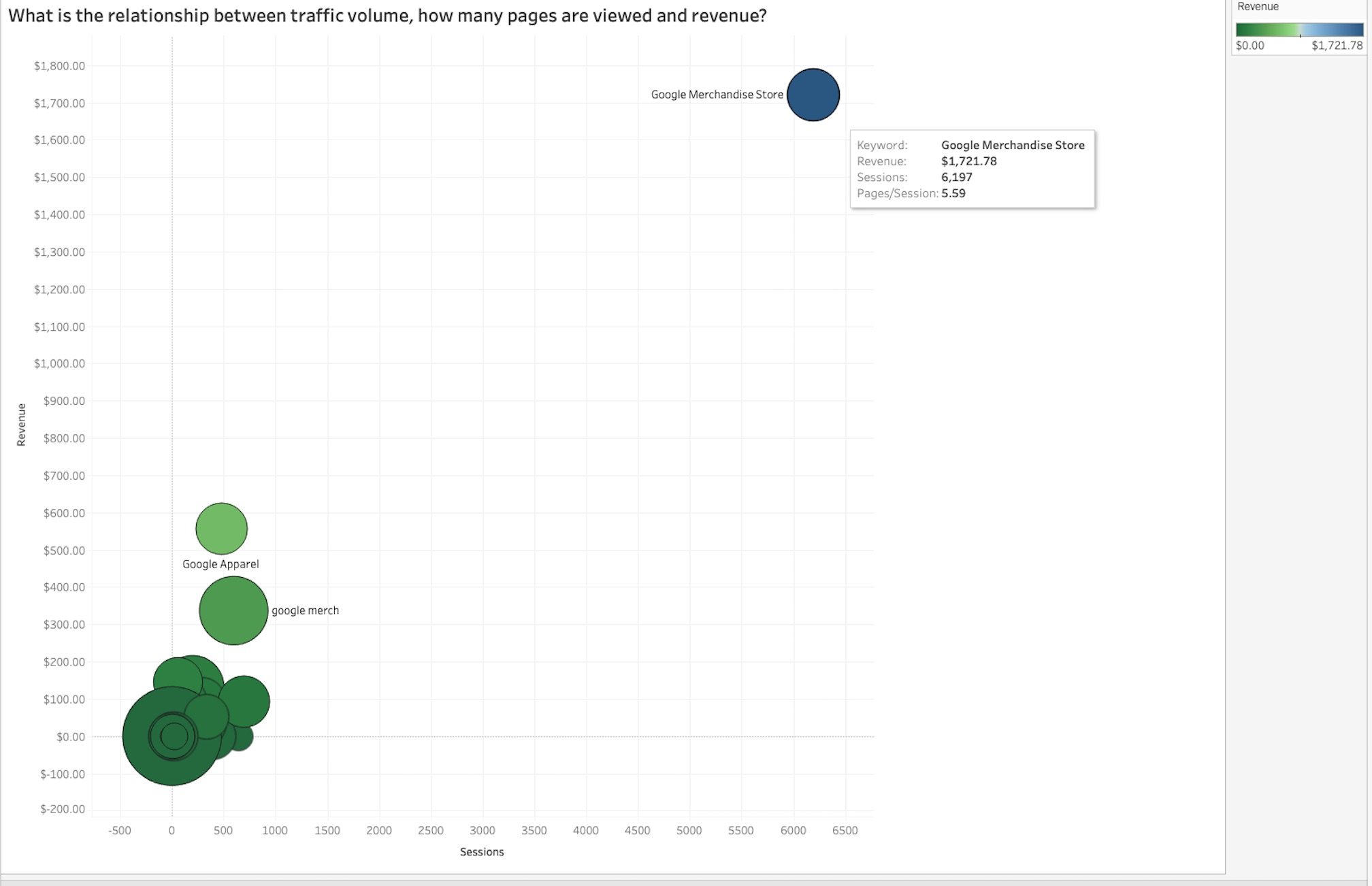
A bubble chart with multiple dimensions can provide so much context in one graph.
- The color of the bubble indicates revenue; dark green at the low end of the spectrum to light green, light blue, and dark blue at the high end.
- The size indicates the number of pages/session; small circles have low pages/session and large circles have high pages/session.
- The position on the grid shows the relationship between revenue and sessions.
The keyword ‘Google Merchandise Store’ generates the most revenue and has the highest number of sessions yet does not have the most Pages/Session. Since this keyword is an outlier, it’s best to remove this keyword from the chart so that we can focus on how to improve the performance for the other keywords.
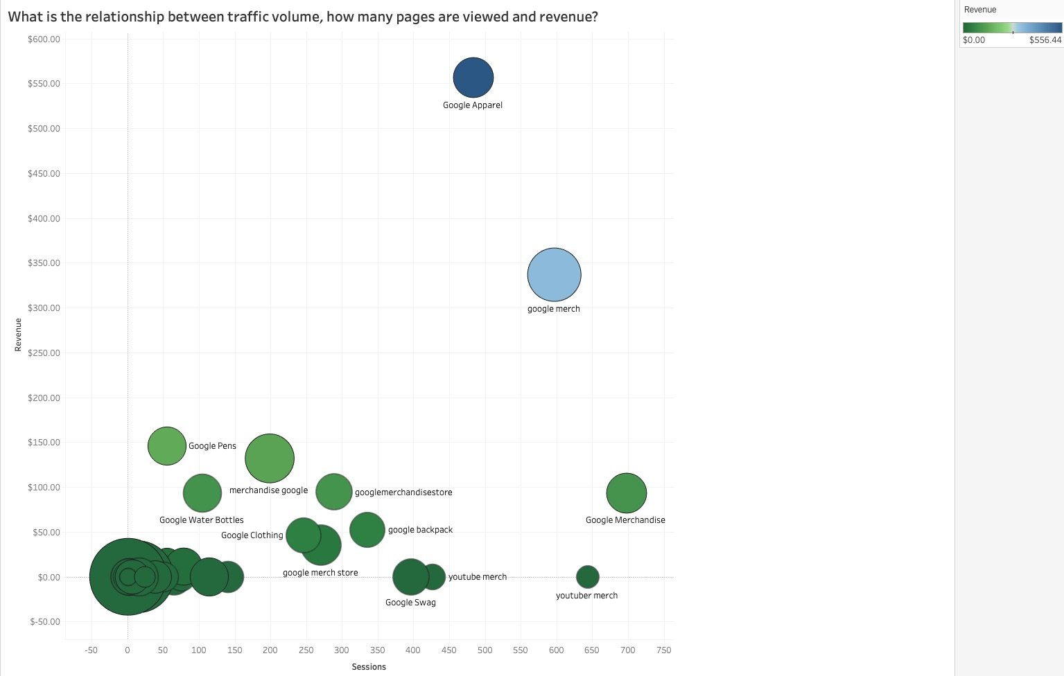
Look at the chart now!

Let’s consider the keyword ‘Google Swag.’ It has a similar sized bubble (Pages/Session) to ‘Google Water Bottles,’ ‘Google Pens,’ and ‘google backpack,’ yet hasn’t generated any revenue. This tells me that the product-specific keywords are performing better than the general keyword. This offers so many more insights than our original Google Analytics screenshot!
The goal of data visualization is to clearly present information in a digestible format. Digital marketing growth and overall success depend on accurate and helpful data. Data visualization can create conversations not only about what has happened in the past but also what we can do to positively affect the future.


Responses