Good user experience requires more than just a pretty design. It involves multiple components working in harmony to help visitors navigate a site and complete their goal in the most efficient manner. From website structure to product details, every element must be optimized with good user experience in mind.
Interested in learning more? Let’s go over 9 unique and fairly simple ways you can use to optimize your ecommerce user experience or UX.
WHAT IS UX AND WHY IS IT IMPORTANT?
UX stands for user experience, which encompasses all aspects of the end-user’s interaction with the company, its services, and its products. It’s important to note that this includes interactions in different devices, which have varying screen sizes.
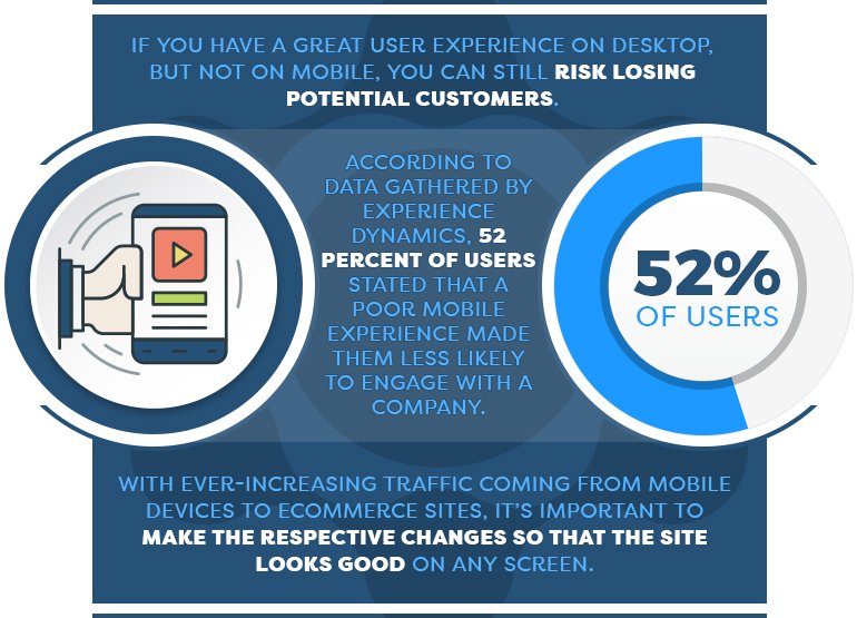
If you have a great user experience on desktop, but not on mobile, you can still risk losing potential customers. According to data gathered by Experience Dynamics, 52 percent of users stated that a poor mobile experience made them less likely to engage with a company. With ever-increasing traffic coming from mobile devices to ecommerce sites, it’s important to make the respective changes so that the site looks good on any screen.
A good user experience can also help you increase your order value by allowing customers to find the products they are looking for faster and by allowing them to discover new ones easily—not to mention, the shopping experience would be so pleasant, customers would want to stay on your site longer, also increasing the chances of them purchasing more items.
Additionally, good UX can help you retain more customers, which increases your customer return rate. This happens because shoppers are more willing to return to an ecommerce store they found pleasant and easy to use.
Before going into details, remember that understanding your target customer’s behaviors and expectations is key to optimizing UX. Only by really understanding your ideal customer’s expectations and how they interact with a site, will you be able to make accurate UX decisions. Let’s get started!
9 UNIQUE WAYS TO IMPROVE UX

Guide Users with Personalized Product Recommendations
Personalized product recommendations can help you guide users to the right products and allow them to discover new ones, thus, potentially, increasing their average order value and creating a better user experience. It’s like having a customer representative giving product suggestions.
For instance, you can have product recommendations to display similar products to the one the customer is viewing in a section called “Customers who bought this item also bought …” See how Forever21 displays this product recommendation below:
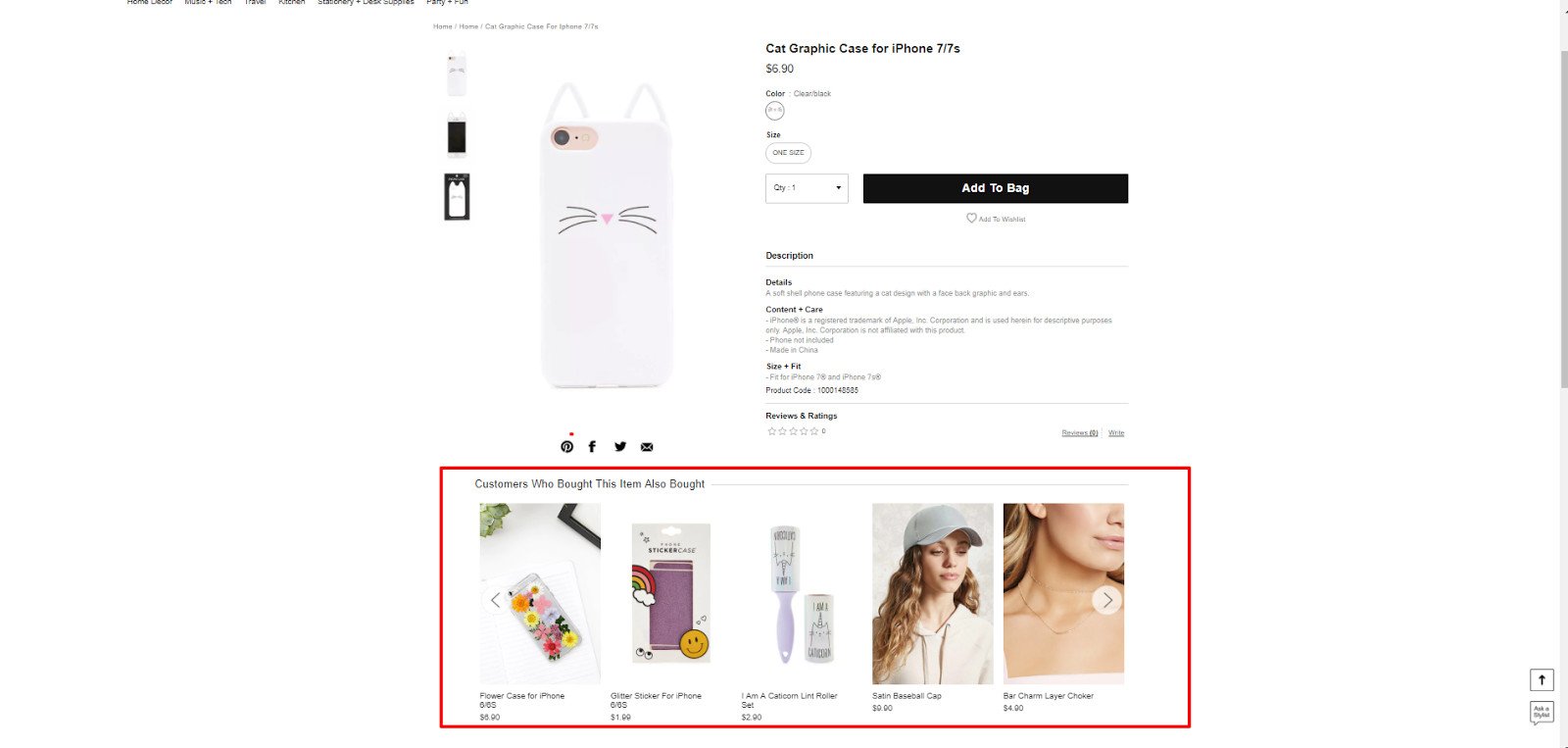
So, a customer that finds this cell phone cover will be able to discover new ones or even find other products he or she didn’t even have in mind.
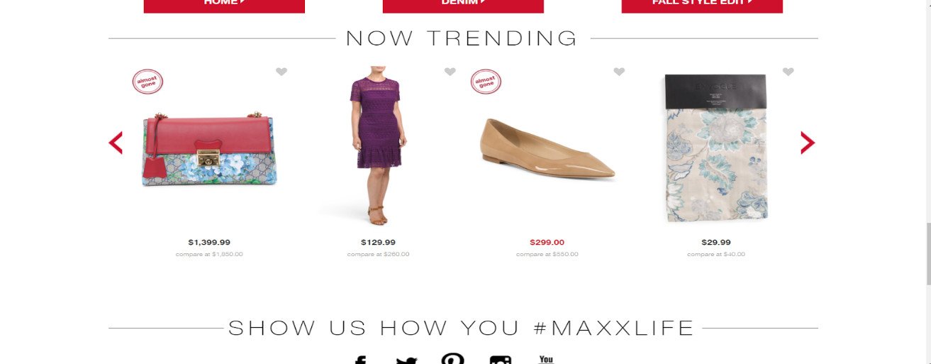
Another widely used recommendation is a “best seller” or “trending” section. These work well because they offer social proof. It makes customers think that if other people are finding those specific products, it must be for a good reason—and those may be the best items to buy. Everyone wants to be part of a trend. See how TJ Maxx includes this type of recommendation in their homepage:
Another great way to use recommendations is to up-sell and cross-sell products. To up-sell, you can show visitors similar products of higher quality and, to cross-sell, you can showcase complementary products that can enhance the product experience. For example, a pair of eyelashes can be paired with eyelash glue and tweezers for easy application.

Organized & Easy to Navigate Website Structure
Imagine walking into a home store and finding bed sheets mixed up with bathroom decor, or aisles with mixed up signs … how would that make you feel? Lost? Disoriented? Your ecommerce visitors can get a similar feeling if you have a poor website navigation. It can take them longer to find the products they’re looking for, and it also makes it hard to discover new ones.
So, what makes a good website navigation? It depends on your ideal customers and the way they shop. This will determine your product classification and what categories you choose to highlight on your main menu. However, there are common best practices that can be used to enhance the user experience.
Start by choosing your top menu categories. If you’re selling products for both men and women, these will usually be the categories that would be at the top, together with the top category products. For instance, see how Nordstrom organized its top menu:
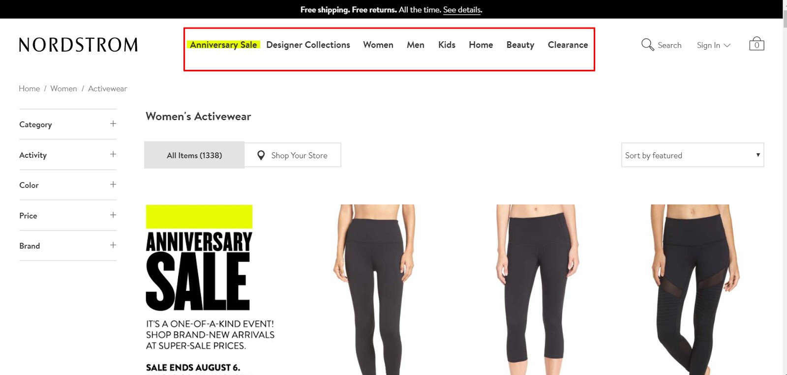
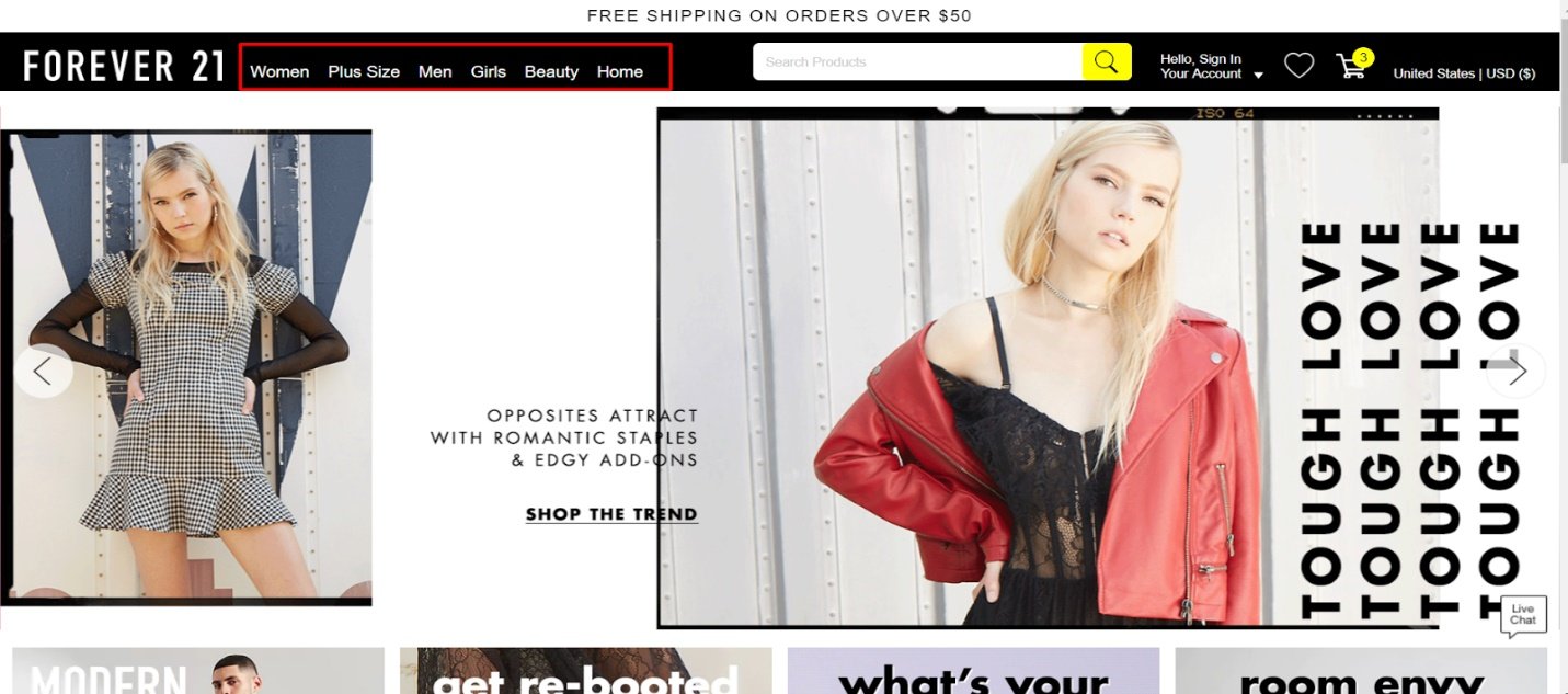
The tab called “Designer Collections” could have been placed within the men’s or women’s tabs, but they decided to place it separately. This may indicate that many of their customers are primarily looking for those categories. Similarly, Forever21 highlights their “Plus Size” selection on their top menu when it could have been included within the women’s section:
Another best practice is to use filters to help users find the type of items they are looking for. Some common filters are category, price, color, and size. For example, if someone visits the tops section, he or she can then filter for the type of top (crop top, long sleeve, etc), then arrange the selection starting with the lowest price, and choose a color and size. This process will save a lot of time that would otherwise be wasted skipping product pages.

Get Customer Feedback
Even following the world’s best practices, there is always going to be room for improvement. Getting customer’s feedback is essential to find out what areas need improvement and make the appropriate changes. Many times, customers even provide suggestions for improvement, saving retailers the time of guessing the answer.
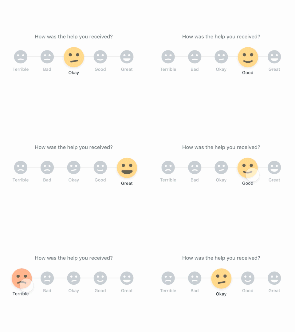
There are some basic components that are key to having a successful feedback process. One of them is having automation. Automate feedback request emails to be sent out after a customer’s first purchase and after set periods of time. This will guarantee consistency and allow you to scale the process. Otherwise, sending emails one by one, whenever you get a chance to remember, can be very time-consuming and ineffective.
Additionally, offer an incentive for customers to provide feedback. Offering a discount code or a free gift on the next purchase is a great way to encourage customers to take action. There are many apps that can help smooth out this process and track results, which can be integrated with platforms like Shopify.
Once the feedback is collected, you can showcase it under specific products or different parts of your ecommerce site. It will help gain the trust of new visitors. If you get bad feedback, make sure to follow up with the customer to acknowledge that the issue is being fixed.

Offer Save to Wishlist Option
Adding to the cart can sometimes be a big commitment for some users. They may like a product but may want to keep browsing for more items to compare them at the end. Or, maybe they are just not sure and want to save products for another time. Whatever the reason may be, giving the option to save products before making a purchase allows users to shop comfortably without being pressured to make an immediate decision. For example, this is how Amazon offers this feature:
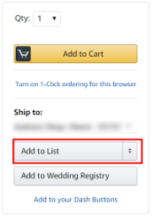
Without such an option, those type of users would have to remember the products they like and then try to find them later, which would mean more work and time from the customer, which equals a bad customer experience. Also, the “save to wishlist” option provides you another way to get the user’s information. Once the customer clicks to save an option, you can take him or her to a simple registration so their list could be saved.
This is very useful because then you’ll be able to send email reminders to those customers to remind them to finish their purchase. You can even send them a special discount code to motivate them to purchase sooner rather than later.

Allow Users to “Drop a Hint”
Saving an item to a list works well when customers are shopping for themselves, but what about when they are looking to get a gift from someone else? Having a “drop a hint” or a registry type of option allows users to send “hints” to others for gift ideas.
Let’s say it’s the wedding anniversary of Mary and John, and John is asking Mary for gift ideas. If Mary visits a site like Tiffany & Co. that offers this option, she can easily send a nice hint to John about her ideal gift, therefore providing a good user experience for both. See how Tiffany tastefully shows its “drop a hint” option below:
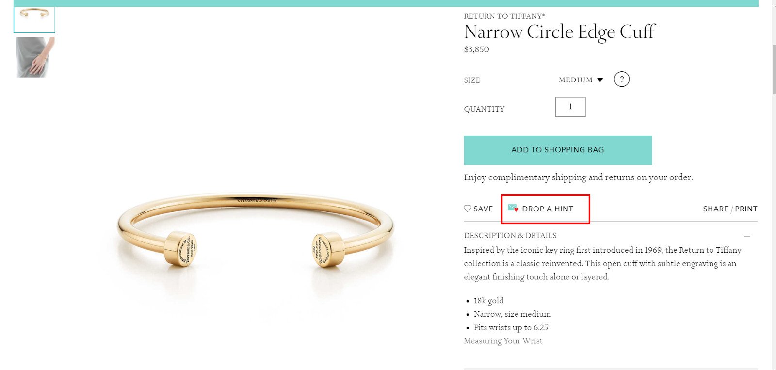
Even if there’s no special occasion, this feature can encourage users to share products with others, bringing more traffic to the site. Also, you’ll get the chance to get the email address from both—the user sending the hint and the recipient—which can be used to send future email reminders to make a purchase. See how the email would look like below:
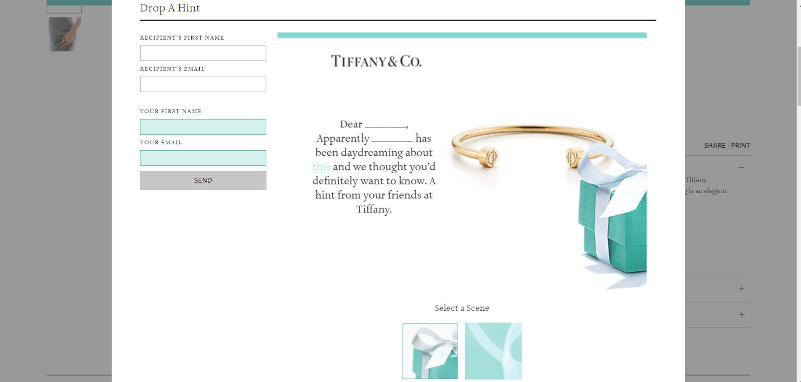
Apps like Drop a Hint Premium can be easily connected to a store like Shopify to enable this feature. Make sure to create a segment in your newsletter list for emails collected from this type of form. In that way, you’ll be able to tailor the email’s message accordingly.

Create an Omnichannel Experience
In a multichannel purchasing world, providing a unified or omnichannel experience is key to success. It will ensure all your visitors get the same messaging and brand image regardless of the platform they are on or the device they are using. In turn, this cohesiveness provides a better user experience and makes your brand more memorable.
Otherwise, a lack of consistency can confuse customers and their expectations about your store. Should they choose your store for fast shipping, high quality, or affordable pricing? Delivering mixed messages can make your unique value proposition lose power.
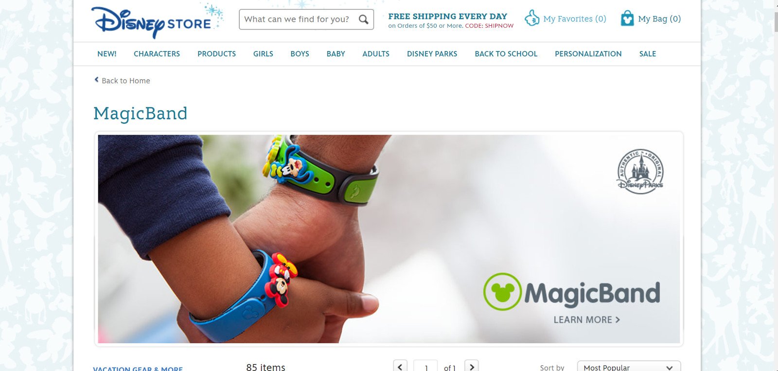
Disney is a great example of a company offering an omnichannel experience. From their website to their app and “magic bands,” Disney makes sure its customers have a seamless experience along every step of the way. In the first screenshot, you can see Disney’s website, where people can easily buy park tickets online.
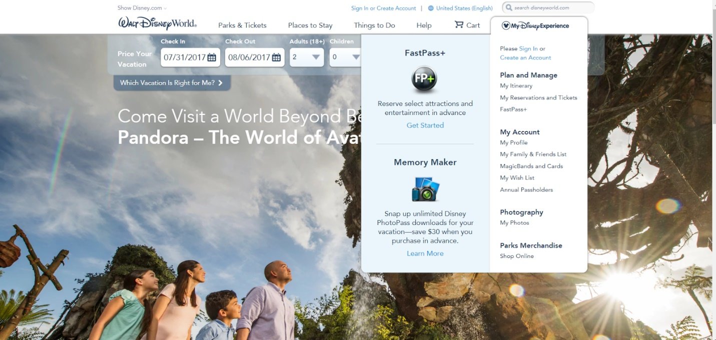
Once the tickets are purchased, park visitors can download the Disney app to plan their whole trip, get food, see showtimes, and more.
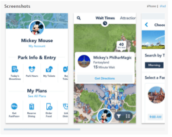
They can also purchase magic bands to get easy access to the parks.

Create Trust with Transparency
The more transparent your website can be with information, such as product details, company policies, and shipping, the more trust you’ll be able to gain from your visitors. Being transparent can help your visitors feel more confident about their purchase, knowing that they have all the information they need to make an informed decision. In doing so, it creates a more comfortable, enhanced user experience.
There are key places where you should be as transparent as possible, such as on product pages, since they are essential in driving conversions. Some types of the most important information you should show are product materials (cotton, spandex, etc), dimensions, special instructions, benefits, and other product information that may seem relevant. Additionally, add trust seals to your website footer and checkout page to instill even more trust.

Offer Social Proof

Social proof can be shown through customer reviews, user generated content like social media feeds, or the number of followers or email subscribers. Any data you can provide that shows support from others can influence visitors to gain more trust in your store, in turn, reducing potential doubts or concerns about your products, which makes for a better user experience.

Engage, Re-Engage, and Award
Customer journeys don’t end with their first purchases. In addition to asking for feedback, it’s essential to engage with them constantly to keep at the top of their minds. You can do this with the help of emails and social media ads. Once your customers return to your store, figure out how you can make their experience as efficient as possible. For instance, you can show them a list of the products they last viewed or added to their cart.
Awarding top customers with special offers and product exclusives can also serve as encouragement to bring them back to the site. Once more, make sure that any special promotional codes or offers are easily redeemable. Otherwise, it can cause a bad user experience.
Summary


Responses