If there’s one page on your site that you never want users to see, but have to proceed as if they will, it’s your site’s 404 error page. For years, having a well-crafted 404 page has been a staple of SEO best practices that we’ve used to help improve websites and make them better. “But Brian,” I hear you wondering, “Why put work into a 404 page? You don’t want users to see it and I don’t think search engines crawl or value it!” You would be correct, nameless voice in my head! 404 pages serve multiple purposes, NONE of them strictly SEO-related. They don’t have weight, they don’t have value in the eyes of the search engines, and many times they aren’t even indexed. Why the heck give a whoopsie daisy about them, then?
I just want to say one word to you. Just one word. Are you listening?
Plastics.
No, wait – wait, sorry, usability. 404 pages are excellent for usability, for a variety of reasons, the main being user stickiness. A solid 404 page isn’t just memorable, but it helps keeps users on your site even if they arrive at a broken page for whatever reason. There are two primary things one should adhere to when creating a solid 404 page, which include…
A Good 404 Error Page Must Be Useful
Any good 404 page worth its salt has a variety of links to various important portions of the website. This includes not only the homepage and HTML sitemap (you…do have one of those, right?), but links to either top level sections, most recent blog posts, or important pages that users spend most of their time on. 404 pages need to help users find this information quickly so they don’t get frustrated or feel stuck, but they also need to help guide users to where they need or want to go next, so they need to be cleanly arranged and easy to understand. It’s not enough just to have a link to the homepage and a search bar, in my opinion – though it’s a step in the right direction. The second tenet of a good 404 page is…
A Good 404 Error Page Must Be Engaging
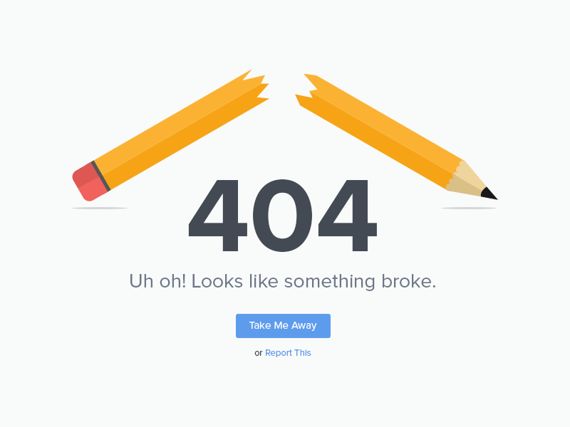
Building on the last tenet, a good 404 page doesn’t simply have to be useful. It should also be engaging. It’s one more way to give the user a memorable experience, by providing them with a moment of levity in their usual web browsing experience. Many 404 pages that are ranked the best or most newsworthy include catchy graphics, interesting bits of interactivity, funny text and much more. A good, solid 404 page should help add to the user experience by being memorable and encouraging the user to return for your products or services again. Now I could spout out platitudes all day, but I’m more of the hands-on type, so let’s do some examples!
Examples Of Solid 404 Error Pages (With Critiques!)
In this portion of the article, I’m gonna show off some 404 pages to popular sites and tell you whether they meet the criteria above successfully or not. Let’s start with:
Wpromote’s 404 Error Page
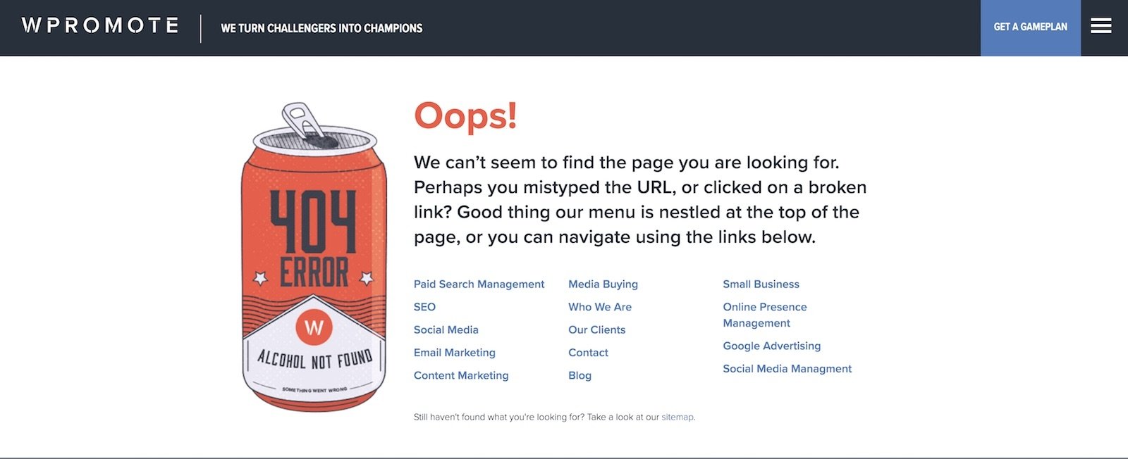
I might be a bit biased here, sure, but I really do like the 404 page of our own site. It’s got some text, links to popular sections of the site, and even a horse fighting a bear! It, to me, hits all the right notes of charm and usability.
NPR’s 404 Error Page
This might be my favorite of the bunch. Why? It has a bit of introductory text, some links, and then links and blurbs to some of their most popular stories about lost things and people, which is both funny and relevant. This not only helps people remember this site and this page, but also engages with users and trusts their intelligence. Overall, an excellent 404 page.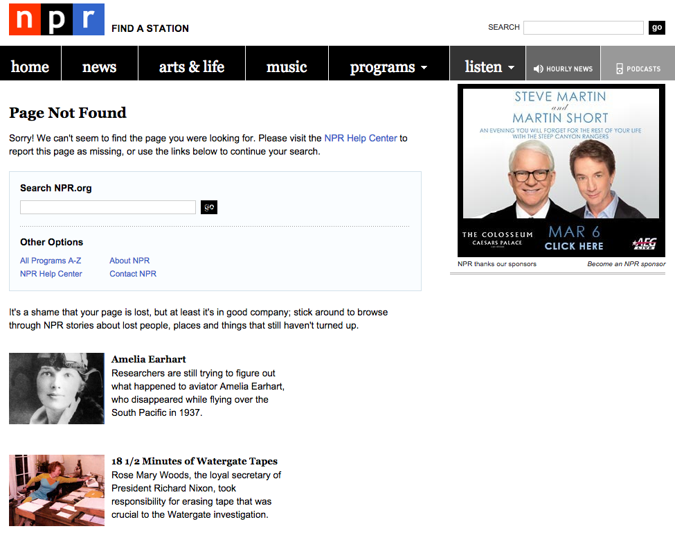
Lego’s 404 Error Page
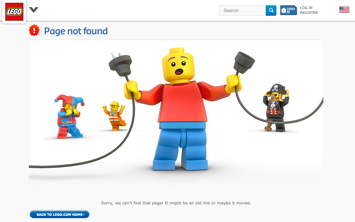
Not much text on this one, but it’s almost too cute to be an issue. As much as I love, love, love, LOVE Lego, I wish this one had a bit more text on it. I mean the image is perfect, and it helps get the site more attention, AND it fits the brand perfectly…for a brand as large as Lego, maybe that’s enough. You, likely, aren’t Lego, however, so you’ll need a bit more content than this one.
Starbucks’ 404 Error Page
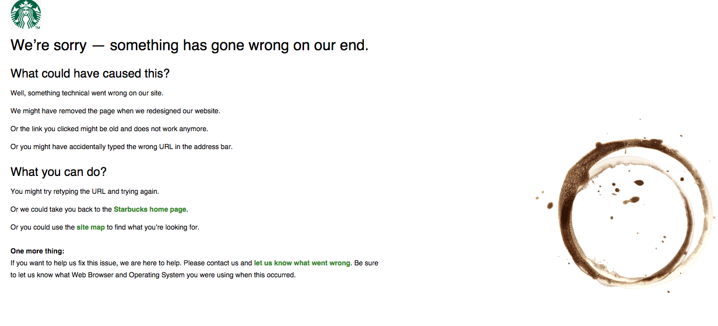
Not a ton of text, but a decent amount, and well-written as well. Only has a few links, but they link to important places. The coffee stain is a really nice touch as well. Overall, this one could be a bit better organized — I’m not a fan of links in body copy, I’d much rather a simple bulleted list of links — but it fits the style and brand perfectly. Is that enough to be the perfect 404 page? It’s close, but it’s no NPR.
Nike’s 404 Error Page
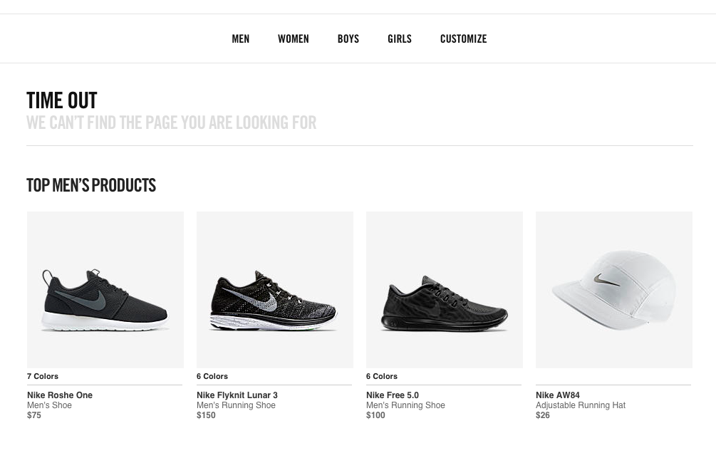
Okay, this is a bit unfair, right? I mean…it’s Nike. They’re such a huge brand they don’t need a lot of text, everyone knows Nike. I disagree, however. I find this 404 page to be a big jarring and disjointed, and not as helpful as I’d like. If I’m looking for a specific product, for example, I’d much rather be presented with a link to that product category, rather than to a similar type of product I’m likely not interested in. I also think this one needs to have SOME content, rather than the barely-a-sentence they have right now. Overall, this one is likely my least favorite.
Conclusion
To close up, a good, solid, usable, engaging, and dependable 404 error page is a key part of any site’s usability strategy. By offering users one more way to get around your site should they get lost or arrive at a broken page, you’re ensuring a user’s stickiness, which is super important these days, as search engines have long been able to monitor how long a user stays on-site and on-page. Thanks for reading these tips, I hope you found them useful, and I hope you’ll give your own 404 page a second look to see if it also needs improving.


Responses