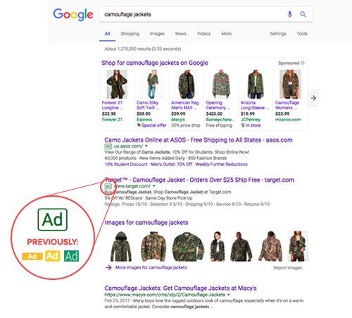
Late last week, Google confirmed that they have changed the appearance of the distinguishing “Ad” label on their paid search advertisements. Google has been testing the new ad label since January and now have rolled it out worldwide to all advertisements. Their motivation seems to be to make it easier for search users to make the distinction between paid search results and organic search results, while simplifying the appearance of Google search results pages for easier readability. A representative from Google stated:
“After experimenting with a new search ad label with a green outline, we’ve decided to roll it out. The new ad label is more legible and continues to make our results page easier to read for our users with clear indication of our ad labeling.”
While Google seems to have stated their reasoning for the change clearly, the digital marketing industry believes that this new ad label design is intended to increase the clickthrough rate (CTR) of search ads. With the color of Google’s new ad label matching the overall color scheme of the search engine results pages, differentiation between advertisements and organic rankings becomes less obvious. Shall we take a look?
What Google’s New Ad Label Looks Like

To sum up what this new ad label looks like, we offer one word: camouflage. The green-outlined, white-filled box with green text is replacing the more noticeable all-green label with white text and the older bright yellow and white label.
Could this change mean that Google is planning on having ads dominate search results pages, encouraging brands to create valuable content that is worth the ad spend to place near the top of results?
Keep an eye out on our blog for updates regarding how this update will affect CTR and other Google advertising metrics!
Special thanks to Travis Tallent and Bria Gutierrez for their contributions to this blog post!


Responses