We are living in a time of instant gratification, so what does this mean for businesses in the digital age? As digital marketers, we must be aware of not only what brings users to a site, but also what keeps them there and guides them through the consumer journey to complete a purchase, book a hotel room, subscribe to a newsletter, download content, or any other various actions that could take place.
Creating the ultimate user experience — from the design to the optimized content — can drive the results you are looking for.
1. Clear The Clutter
Gail Blanke, a celebrated motivational speaker and renowned personal life and executive coach, states in her book Throw Out Fifty Things – Clear the Clutter, Find Your Life, “When we throw out the physical clutter, we clear our minds. When we throw out the mental clutter, we clear our souls.”
You may be asking yourself: how does this apply to my website? Think of the soul as your business, the mental clutter as the goals and purposes of your website, and the physical clutter as the content. In terms of physical clutter (content), spend time going page by page and ask yourself these questions:
- What is the purpose of this content?
- Is this necessary?
- If I were a user, what would I do with this information?
If your answers aren’t clear, it may be time to clear that clutter. When your site is stripped down to the bare bones, you’ll know the goal and purpose of every page and every piece of content, therefore sorting out the mental clutter and setting yourself on a path of proper user experience optimization.
2. Establish A Site Architecture

Just like a desk or living area, a website should be neat and organized to ensure that you are able to move freely and efficiently. A proper site architecture is key to creating the perfect pathway for the consumer. Your pages should be properly named and easily accessible.
Remember, “The name you choose it’s like, it’s like a promise you make.” – 11th doctor from “Doctor Who.”
OK, Tucker, we get it, you’re a nerd, but what does that quote mean? Well, it’s elementary, my dear Watson. What you name your pages should be an accurate reflection of the content that is on that page. Delivering relevant content to your users will keep them on the site longer and lower your bounce rate, two metrics that Google measures in its algorithm when sites are listed on the search engine results page.
On top of delivering relevant content, you should ensure that you are delivering content in general. Use tools like Screaming Frog to easily check your site for any pages containing 404 errors and 302 redirects and make adjustments as soon as possible. Having these status codes on pages can negatively affect your site on SERPs as Google can potentially see that your site is not kept up to date.
3. Use Stunning Visuals
Don’t be afraid to stand out. Just like aligning your furniture or decorations around a centerpiece, ensure that your site has a very stunning visual aesthetic. This can help guide placement of all of your site’s content, especially pictures. Photos are most likely a user’s first look at your brand, so make sure they are enticing enough to keep their attention. Whether you’re a high-end resort, a local coffee shop, or an Ecommerce vendor, portraying not only the product but also the experience is a great way to drive brand trust and with it, consumer conversion rates.
Gone are the days of buying a stock photo of a beach, a cup coffee on a table, or a product that’s vaguely similar to yours. After all, you wouldn’t buy a frame to hang in your home and leave the photo of the stock family in it, would you? Capture your products and experiences accurately with high-quality photos of a couple or family relaxing on the loungers on your private beach, a branded cup of coffee, or someone using your product in their everyday lives. Showing real people interacting with your brand brings viewers into the scene. Just as the photos in our homes and offices capture moments, the photos on your site should invite guests to create their own.


While iPhone photos may work for personal social media channels, it will be worth it to use a professional photographer with the proper equipment for photos going on your website. It may sound like a steep purchase, but providing a good user experience will help drive your online ROI.
Be aware that while photos are great, they should be strategically placed throughout your site. Don’t place photos where they have no business being, like on a footer or sporadically throughout the site. These types of practices contribute to the clutter we are trying to clear.
4. Have Clear Calls To Action
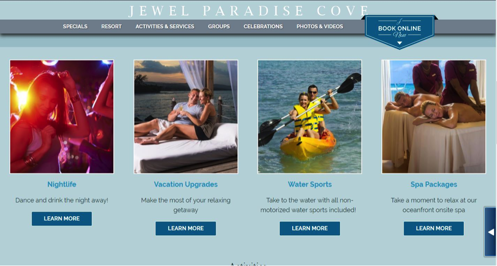
Remember when I asked you earlier to figure out the goals of your site? Make those known with easily clickable buttons like “Subscribe Today,” “Learn More,” or “Book Online Now.” Make sure these calls to action stand out and aren’t lost in translation with the rest of your website copy. Use contrasting colors and bold fonts to easily draw the attention of the user. Think of your call-to-action buttons as Zen spots. Ultimately, we want users to focus their energies here. However, having too many spots can lead to chaos and confusion.
5. Curate Your Content Well
If you’ve spent any time in digital marketing, you are sure to have heard the famous quote by Bill Gates, “Content is king.” Earlier we discussed three questions you should be asking yourself in regards to content. For the curation process, focus on the first and last questions.
What’s the point of this content? A general rule of thumb is the content should be engaging, entertaining, and informative. If you can find the sweet spot to create that perfect content, Wpromote may be hiring. But in all seriousness, it’s no longer enough to just create content — it’s all about quality content. Your content should stand out in the sea of information that is the World Wide Web but also have a natural feel like it truly belongs on your site. Mixed media is a great way to drive engagement, like a nice art piece in the center of a room that you want your guests to ask you about. However, if it doesn’t fit naturally, don’t force it. Content should fit the context. If one particular medium isn’t working, find new ways to push your content, such as short videos or infographics. Using creative means to deliver information is a great way to build a memorable brand and message.
In terms of optimization, think of SEO as “search experience optimization” rather than “search engine optimization” because by focusing on the user, you can deliver a great experience, provide quality content, and ultimately establish a better brand relationship.




Responses