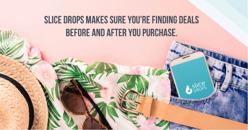
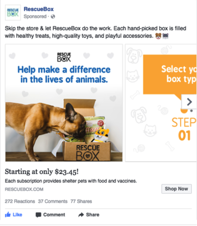
In the current digital era, more and more companies are choosing to integrate unique, captivating images to add value and attract customers’ attention to their media platforms. Whether it be through the internet, social media, or TV, consumers are bombarded with thousands of different advertisements each and every day. The only way to truly grab attention from the traditional “noise” of digital ads is to generate creative that is powerful, disruptive, and, well, creative.
Research has found that 90% of the information that the brain processes is visual, and the brain processes images 60,000 times faster than text. So when you’re paying to place an ad in front of a viewer’s eyes that you’re nearly certain they’ll see, you’ll want to make it count, right? Too much text, an awkward crop, or the wrong file size leading to a blurry image can destroy even the most high budget ad campaigns. Here are some specs and best practices to ensure this doesn’t happen to yours:
Images (General):
- If you are shooting, make sure everything can be transitioned to social or square. Brands need to keep social frames in mind from the start when taking photos.
- Stock photography is not the enemy when choosing photos so long as it aligns with your brand. There is a right and wrong way to pick the images – make sure it’s not too fake and staged. A pretty background on even a sentence of text is infinitely more engaging than an image without.
- A common issue when buying stock images is that they may be too small. To be safe, always get a bigger image whenever possible. Crop to be the correct size, but always double check to make sure everything important is still in the frame.

Facebook:
- Upload images that are at least 1200 x 628 pixels for display on high resolution devices.
- Single image and carousel are the most widely used.
- If your ad is a promotion, use images that contain less than 20% text. Text correlates with the reach of your ad – Facebook’s algorithm favors ads that look most native in the feed.
- You can run a square ad in carousel in Facebook. This is a great ad unit if it’s a new launch of a summer line or if you’re trying to get people to sign up for event. Carousels are native to the feed, so it makes it look more organic.

- PRO TIP: You can run your image through an Image Text Rating system and it will tell you if your use of text is low, medium, or high.
Facebook Video:
- It is essential to identify the brand in the first 3 seconds of the video. According to Facebook, if a brand is shown in the first 3 seconds of an ad, it aids in brand recall later. People are more likely to know who the brand was and what it was promoting.
- Specs should be 1200 x 628 pixels if it’s in line with the feed.
- Be sure to choose a thumbnail of the video that is engaging and shows the brand name so that when it isn’t playing, a branded image is what shows up on someone’s feed (rather than just a black background).
- Keep the video 15-20 seconds in length – anything under 30 is preferred. Make sure you have captions turned on so it can still be effective when the sound is turned down.
- If there is text added into the video, make sure it is legible and complements the ad rather than overpowering it.
Instagram:
- For Instagram, the general guidelines are the same.
- Always optimize for Instagram and keep it square (1080 x 1080 pixels).
- Best practices: if at all possible, put text in the body of the ad post, not in the image itself.
- If your ad does use text, try to do so in a way that is creative and fun.
- Carrousel on Instagram is a great way to showcase products for your customers – it tells a story and is creative in nature.
Instagram Stories:
- Ideal dimensions for Instagram stories are 1080 x 1920 pixels.
- Instagram Story paid ads should feel more like another Story and less like an ad. These are immensely more engaging and people will want to watch this!
- Use features that feel organic like Instagram stickers, and font with color on a block around it.
- Having music can be fun and catches people’s attention. One way you could get users to do this is by adding “Sound On” as text.
- Instagram Stories are also available as a paid feature. These have a call to action – they’re new, and not many people know how to use them very well just yet. Jump on this before your competitors do!
- Unlike Snapchat ads, Instagram Stories contain a swipe-up function which can direct users to a company’s Ecommerce site — where any subsequent purchases can also be accounted for.
Pinterest:
- Vertical aspect ratio: ideal dimensions are 600 x 900 pixels (a 2:3 aspect ratio).
- For mobile-optimized: make sure the text is legible on the small screen by adjusting font size for phone rendering.
- For organic Pinterest content, highlight boards that are seasonally relevant.
- Like others above, less text is more, and don’t be afraid to let your images speak for themselves!
- For detailed descriptions, be sure to describe your brand in vivid and descriptive words.
Creative is arguably one of the most integral components of your Facebook, Instagram, or Pinterest campaigns. After you’ve effectively designed and composed engaging creative, it’s your turn to sit back, relax, and discover how strongly beautiful images resonate with your audiences – and the results will be unparalleled, too. If you think your business is in need of some killer new creative or social media content strategy, we’d love to chat!


Responses